Income inequality linked to social vulnerability to disasters
Community resilience estimates show that 23.4% of people in counties with high income inequality are socially vulnerable to disasters.
The share of residents socially vulnerable to disasters is higher in counties where income inequality is the same as or greater than the national average, according to a U.S. Census Bureau analysis.
The analysis of the Census Bureau’s Community Resilience Estimates (CRE) Equity Supplement linked social vulnerability and income inequality.
The CRE provides an easily understood metric for how socially vulnerable every neighborhood in the United States is to disasters, including wildfires, flooding, hurricanes and pandemics such as COVID-19.
Nationally, 20.6% of people were found to be highly vulnerable to disasters in 2022. But in counties where income inequality was at or above the national average, 23.4% were highly vulnerable. In counties with income inequality below the national average, 19.2% of residents were deemed highly vulnerable.
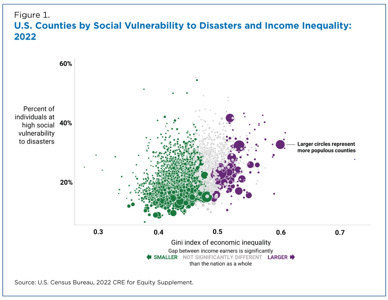
Figure 1 shows the relationship between the share of the vulnerable population and the income inequality in each U.S. county. Each circle represents one of the nation’s 3,144 counties, with larger circles representing more populous counties.
Counties with higher levels of income inequality — farther to the right — tended to have a higher share of individuals more socially vulnerable to disasters — closer to the top.
For example, the large purple circle on the far right is a populous county (New York County) with high income inequality (0.5980) and high social vulnerability (33.1%).
Gauging social vulnerability to disasters can help community planners, government entities and stakeholders to prepare for a disaster and plan response and recovery efforts.
The CRE provides an easily understood metric for how socially vulnerable every neighborhood in the United States is to disasters, including wildfires, flooding, hurricanes and pandemics such as COVID-19.
Modeled estimates are based on 10 components of social vulnerability including income, and access to transportation and the internet. Current estimates use Census data and provide the number and percentage of residents in the nation, states, counties and census tracts in three groups, people with zero, one or two, and three or more vulnerabilities.
CRE for Equity
This analysis used the 2022 CRE Equity Supplement, also known as the CRE for Equity, which pairs data from the 2022 CRE with stats from the 2018-2022 ACS; 2020 Census; and the Census Bureau’s Planning Database. The findings are the most recent measures of social vulnerability and equity in one source.
There are several new data points in the newest version of the CRE for Equity. Key indicators are available for major race and ethnic groups from the ACS, though it wasn’t used in the analysis in this article.
Users can review area level statistics and explore how these characteristics differ based on race and ethnicity. These data include information on topics such as income, age, unemployment, and health insurance status that play a role in measuring equity.
What the CRE Shows
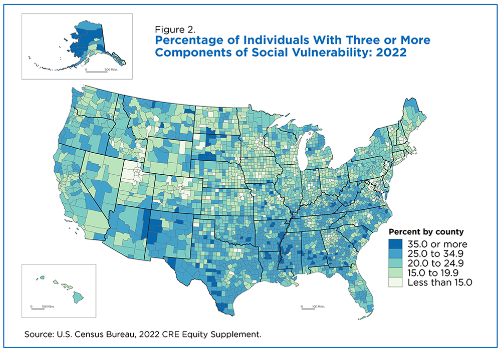
The CRE shows the number and percentage of residents living with zero, one-to-two, or three-plus components of social vulnerability. Those with three or more components are considered to be the most socially vulnerable group and more susceptible to a disaster (Figure 2).
Social vulnerability to disasters is not distributed uniformly. Rather, a swath of counties from the Southwest to the South Atlantic tended to have a greater share of individuals with three or more vulnerabilities.
How Income Inequality Is Calculated
The ACS provides a variety of income measures, including the Gini index, a widely used measure of income inequality.
The Gini index measures income inequality ranging from zero to one, reflecting the amount that any two incomes differ, on average, relative to mean income. It is an indicator of how “spread out” incomes are from one another.
Values closer to zero represent a more equitable distribution of income. For instance, if every income earner in a county made exactly $10,000 per year, the Gini index would equal zero. But if one income earner made $10,000 and all other people earned $0, the Gini index would equal one and, therefore, be less equitable.
Income inequality increased in the United States from 2007 until 2022 when it dipped mainly due to income declines among middle and top income earners.
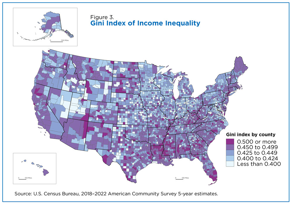
The national average of the Gini index is 0.4829 but income inequality varied widely across the country. Some counties had an estimated Gini index of 0.35 or less (Figure 3). Others had Gini index estimates greater than 0.55, which was higher than most of the world’s countries for which data were available.
Income inequality tends to be concentrated in the Southeast, roughly mirroring the pattern found for social vulnerability to disasters.
For this analysis, we compared the national estimate of inequality to that of each county to determine if there was a statistical difference. We then calculated the number of people with three or more components of social vulnerability in each type of area and found that areas with lower inequality were less socially vulnerable.
These results are consistent with prior research on the impact of income inequality on key well-being measures such as mental health, physical health and longevity.


