Study: Climate change graphics in IPCC reports are too complex
When the "hockey stick" graph, which illustrated a steep increase in global temperatures, was published in 1998, it reshaped the world's understanding of climate change. A quarter-century later, with climate change now wreaking havoc around the world, graphics depicting global warming are more important than ever to inform policymaking. However, a recent USC-led study reveals that some graphics developed for reports by the Intergovernmental Panel on Climate Change (IPCC) are too complex, even for the intended audiences of policymakers and practitioners.
Researchers recommend limiting each graphic, which the IPCC refers to as "figures," and its title to one key message. The study produced a detailed checklist to improve the design of graphics that target policymakers and practitioners.
"Because climate experts want to be accurate and complete, they tend to cram too much information into their graphics," said Wändi Bruine de Bruin, the study's lead author and Provost Professor of Public Policy, Psychology and Behavioral Sciences at the USC Sol Price School of Public Policy and the USC Dornsife College of Letters, Arts and Sciences.
"A graphic is worth a thousand words, but only if it clearly communicates one key message."
The study was published in the journal Climatic Change with the title "Improving figures for climate change communications: Insights from interviews with international policymakers and practitioners."
This is the second study in which USC researchers collaborated with the United Nations Foundation to improve the effectiveness of climate change communication. The first study, which looked at language comprehension, was published on Aug. 21, 2021, in a special edition of the journal Climatic Change titled "Climate Change Communication and the IPCC."
"This research sheds new light on how policymakers and practitioners engage with, interpret, and utilize IPCC report graphics," said Pete Ogden, Vice President of Climate and Environment at the United Nations Foundation. "This will be a valuable tool not only for the IPCC as it embarks on its new report cycle, but for anyone engaged in the vital work of making climate science clear and accessible."
Global collaboration produces results
In collaboration with the U.N. Foundation, USC Dornsife Public Exchange convened a team of USC behavioral scientists to interview 20 policymakers and practitioners from the IPCC's and U.N. Foundation's global network.
Participants viewed three figures drafted for the Second Order Draft Summary for Policymakers from Working Group III of the IPCC's Sixth Assessment Report. Interviews typically reach saturation - revealing no new topics - after talking to 15-20 participants. This study achieved saturation by the 15th interview.
The study's participants came from developed economies with robust climate science research capabilities, like the United States and Germany, and developing economies, like Chad. Participants representing various sectors were asked to rate how easy or hard it was to understand the three graphs.
One participant remarked, "My first impression is: too much information." Another questioned, "So as a policymaker, what is the message?"
The researchers noted that the graphics appeared to be designed primarily for scientists without considering a broader audience. This can cause graphics to be too technical and complex. Readers often engage with graphics first and might share them out of context. Indeed, more than half of the participants said they tended to review graphics before reading the main text of a report.
"Well-designed graphics play an important role in helping nonscientists understand the menace of climate change," said Lance Ignon, senior associate dean of communication for the USC Price School, a study coauthor, and former communication consultant to the IPCC. "The hope is that a better understanding of the threat - and the responses to it - will prompt greater willingness to take action."
Simplicity shouldn't compromise accuracy
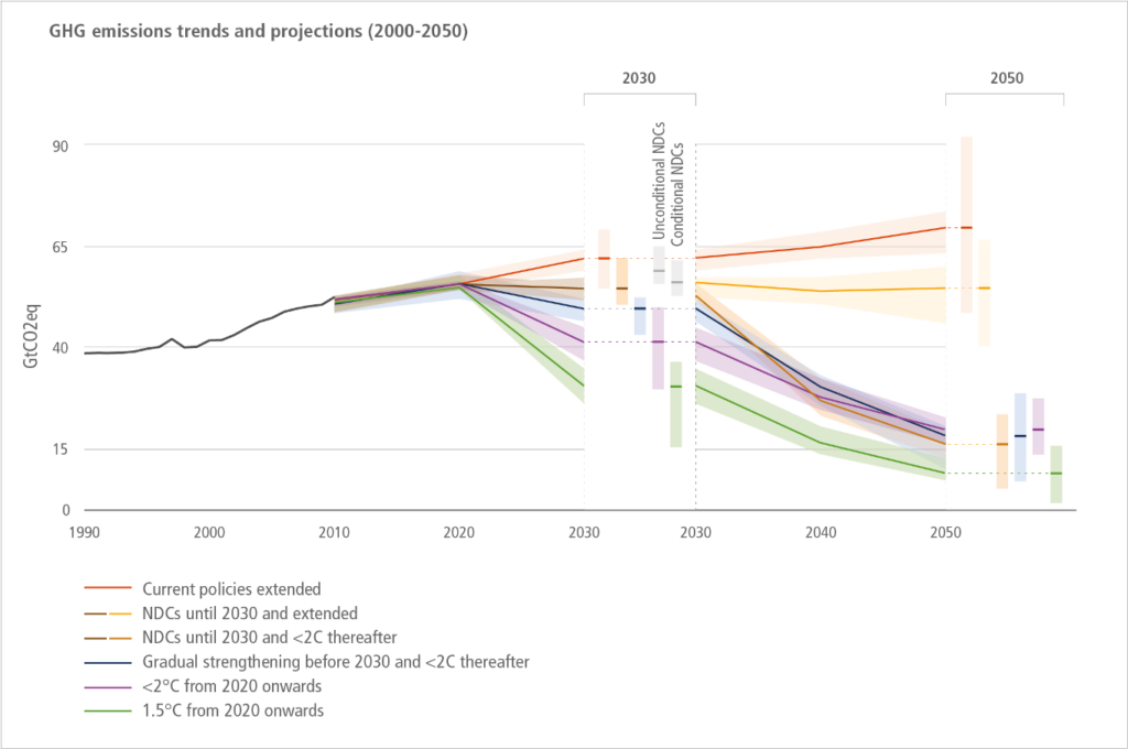
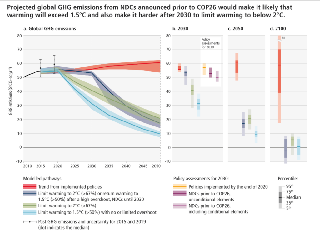
The three graphics assessed were "GHG [greenhouse gas] emissions trends and projections," "Feasibility challenges" and "Breakdown of average investment needs until 2030." "GHG emissions trends and projections" was the only graph revised for inclusion in the IPCC's report; the other graphs were not.
Specifically, the graphic illustrating GHG emissions - emissions causing climate change - drew mixed responses because of its dense presentation of data. One participant suggested dividing it into two or three graphs for better clarity.

In response, the IPCC revised the graph's format and title to reflect the key message.

Similarly, even participants familiar with IPCC's graphs found a graph depicting the need for climate investment confusing. An occasional user of the IPCC graphs said, "You've got to read the fine print, and you shouldn't have to read the fine print. I mean, these graphs should stand on their own."
A challenge for IPCC authors lies in simplifying graphs without sacrificing accuracy or details, however.
Clarity is key
Participants also struggled with graphs that had unclear titles - as was the case with the GHG emissions graph - ambiguous labels, indistinct color schemes, complex scientific jargon and captions that read like technical footnotes. They wanted clarification about specific technical terms and acronyms.
To improve climate change communication, the team developed a checklist for designing more effective graphs for IPCC reports and other communications. The checklist recommends following graph design best practices and including audience feedback to improve climate change communication.
"We are excited that our study provides a user-friendly checklist for the IPCC to create graphs that are more accessible," said Monica Dean, Climate and Sustainability Practice Director at USC Dornsife Public Exchange.