Key concepts
- June 21 is #ShowYourStripes day - a time to spread awareness about climate change using the iconic 'warming stripes' graphics showing temperature trends over the last 100+ years.
- Download and share warming stripes for 195 U.S. cities, 49 states, the country, and the globe.
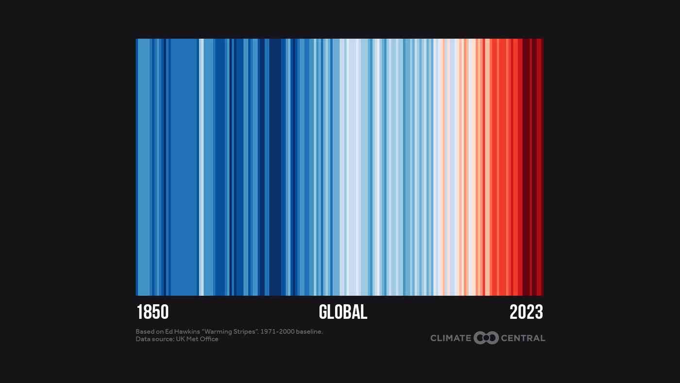
- Each colored stripe represents the annual average temperature relative to a long-term average.
- Red stripes are years that were hotter than average; blue stripes are years that were cooler.
- The strong red shift shows rapid warming in each city and across the globe.
Show up for #ShowYourStripes on June 21
#ShowYourStripes is a global campaign to spread awareness about climate change using warming stripes graphics. The iconic blue and red barcode will appear on landmarks, TV screens, magazines, and more as the world unites to show their stripes on June 21.

Global warming stripes: sparking climate conversations
Created by Professor Ed Hawkins, a climate scientist at the University of Reading, the global warming stripes are a simple visual representation of the long-term rise in global temperatures due to human-caused climate change.
Each stripe represents the global temperature averaged over one year, from 1850 to 2023. Red stripes are years that were hotter than the 1971-2000 average; blue stripes are years that were cooler.
The global warming stripes graphic shows a rapid shift from blue to red stripes in recent decades as carbon pollution has warmed the planet.
Global temperatures shattered records in 2023, ranking highest in the 144-year record at 1.4°C (2.5°F) above early industrial (1881-1910) temperatures. Last year broke records by such a wide margin that it's forcing an expansion of the warming stripes color scale earlier than expected.
This record heat streak has continued into 2024 with 12 consecutive months (June 2023 to May 2024) of record-breaking global temperatures --- pushing the planet dangerously close to the internationally-agreed goal of limiting warming to a long-term average of 1.5°C (2.7°F) above pre-industrial levels.
This underscores the urgent need to turn climate conversations - sparked by warming stripes - into faster climate action.

U.S. warming stripes
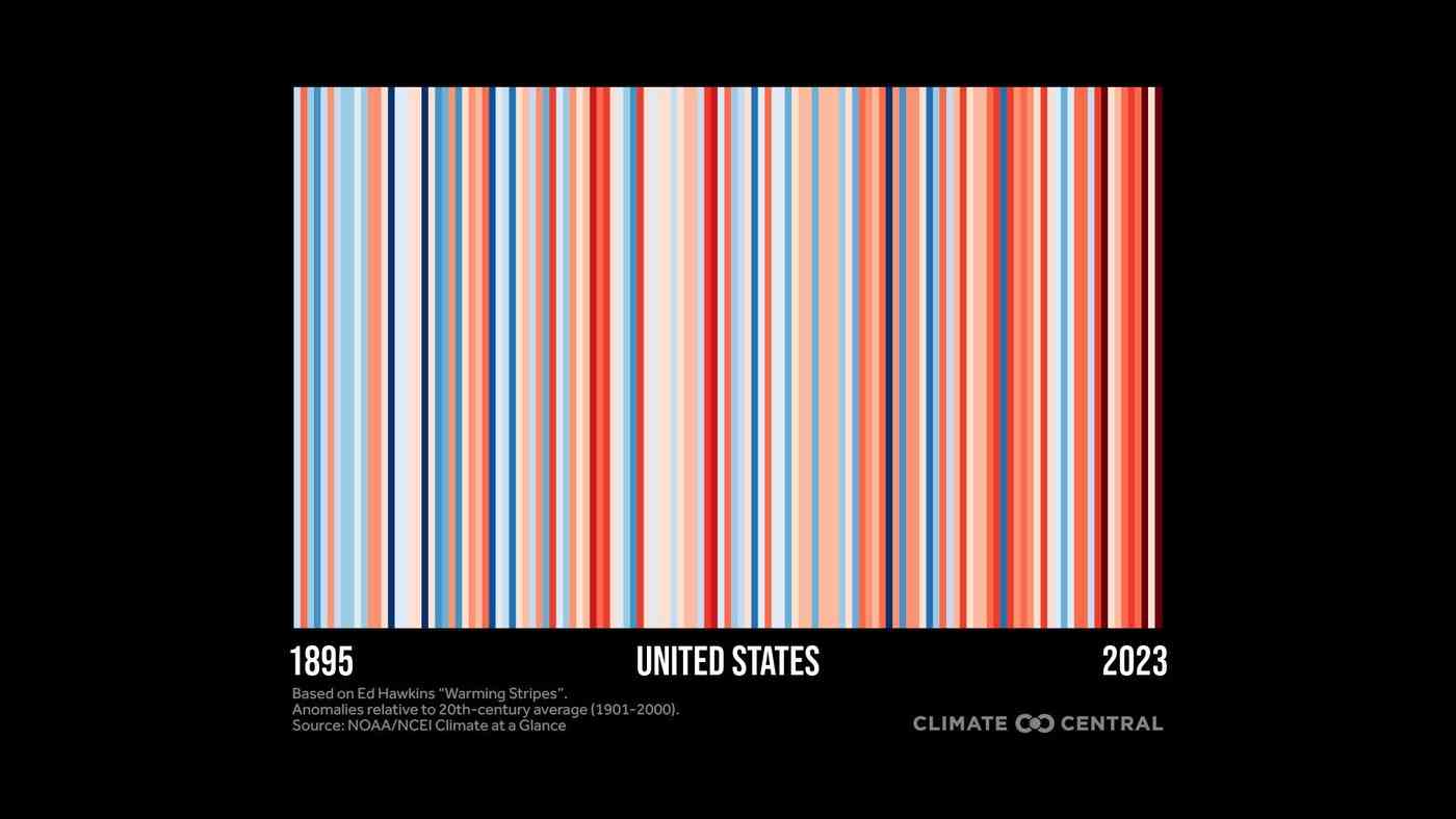
Climate Central analyzed historical temperature data through 2023 to produce warming stripes graphics for 195 U.S. cities, 49 states (excluding Hawaii), and the entire U.S.
Each graphic shows 100+ years of temperature change relative to the long-term average at the city, state, or national level. See Methodology below for details.
Most locations show a strong warming trend, especially in fast-warming regions like the Southwest, Northeast, and Alaska.
Ways to #ShowYourStripes
Here are some ways to #ShowYourStripes on June 21st --- or any day of the year --- to spark climate conversations.
- Visit Climate Central's Show Up for Stripes Day page for more free graphics, examples of warming stripes in action, and to locate landmarks that will light up for #ShowYourStripes day.
- Share your warming stripes on social media, TV broadcasts, and in local climate reporting to communicate about warming in your city, state, or across the U.S.
- Explore Climate Central's resource library for hundreds of graphics and reporting resources that explain the local effects of global climate change --- from local impacts (such as warming summers, more frequent fire weather, and heavier downpours) to local solutions (such as growth in solar and wind energy, ways to cut carbon pollution in each state, and the cooling power of trees in your city).
- Update your social accounts with warming stripes as Zoom backgrounds and filters for Twitter, Facebook, and LinkedIn.
Seeing red
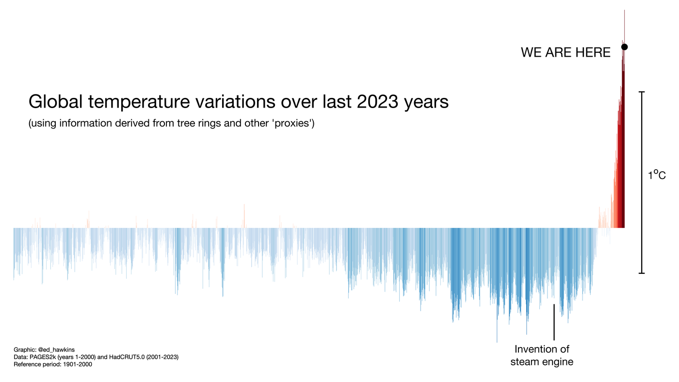
Warming stripes make it clear that today's temperatures are warmest on record. And stripes going back 2,023 years using paleoclimate data show the unprecedented pace and scale of modern climate change compared to fluctuations over millennia.

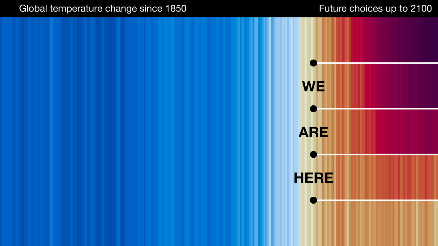
These graphics can also be used to show how our actions today will determine what color stripes younger generations will live through this century as warming continues.

Climate Central recently analyzed how much warming younger generations could experience during their lifetimes if carbon pollution either continues, or is cut rapidly.
The analysis shows that younger generations (Millennials, Gen Z, and Gen Alpha) across the U.S. could experience between 6 to 7°F of warming over their lifetimes if high levels of emissions continue. These levels of warming would bring rapid change and more extreme events such as heat waves.
But the same Climate Central analysis also shows the powerful effects of the choices we make now.
The data show that keeping global warming under 2°C (3.6°F) with rapid cuts in carbon pollution would set younger generations on a radically different path - toward a far safer future with less warming and fewer risky extreme events.
Solutions for a cooler, safer future
The tools we need to choose this cooler, safer future are already available. For example:
The U.S. produced enough wind and solar energy in 2023 to power the equivalent of more than 61 million average American homes --- reflecting a decade-long surge in the country's wind and solar capacity that's projected to continue.
Heat-trapping emissions have already decreased in most U.S. states since 2005.
The solutions needed to accelerate these recent trends by cutting carbon from transportation, electricity, agriculture, and industry already exist - and are expanding across the country.
U.S. clean energy investment has never been higher. And most U.S. states are set to experience a boom in wind and solar energy capacity by 2035, when solar and wind are expected to make up more than 50% of energy capacity in 46 states.
Find experts
Submit a request to SciLine from the American Association for the Advancement of Science or to the Climate Data Concierge from Columbia University. These free services rapidly connect journalists to relevant scientific experts.
Browse maps of climate experts and services at regional NOAA, USDA, and Department of the Interior offices.
Explore databases such as 500 Women Scientists, BIPOC Climate and Energy Justice PhDs, and Diverse Sources to find and amplify diverse expert voices.
Reach out to your State Climate Office or the nearest Land-Grant University to connect with scientists, educators, and extension staff in your local area.
Methodology
The global warming stripes design was developed by Ed Hawkins, Ph.D., Professor of Climate Science at the University of Reading, as described here.
Within this brief, warming stripes for the globe, the contiguous U.S., 49 states (excluding Hawaii), and 195 cities are based on the annual average temperature anomalies. For cities with data beginning in 1901 or before, anomalies are relative to the 20th century (1901-2000) average. For a subset of 46 cities, whose period of record begins after 1901, annual temperature anomalies are relative to the oldest available 100-year average for each city. Stations with less than 100 years of data were excluded. The baseline for each location (whether the 20th century average or a custom 100-year period) is indicated in the footnote on each warming stripes graphic.
Data for the globe, the contiguous U.S., and U.S. states are from NCEI Climate at a Glance. Data for U.S. cities are from the Applied Climate Information System weather stations.
For each location (U.S., states, cities), the average temperature over the baseline period (either 20th century or custom 100-year period) is set as the boundary between blue and red color scales. The full color scale spans +/- 2.6 standard deviations of each location's annual average temperature anomalies relative to the baseline period (either 20th century or custom 100-year period). The full color scale uses 16 colors: the eight most saturated classes of the nine-class sequential blue and red color scales.